About Our Title Sequence
About our title sequence
Hey fellow bloggers, and welcome back to my account. I hope you're all having an amazing day. Today, I'll be covering the details of my film opener's title sequence and why exactly we chose to do these things. Although we don't have access to the best or most advanced editing software, we still have a great deal of control over the font, style, and colors of our title sequence.
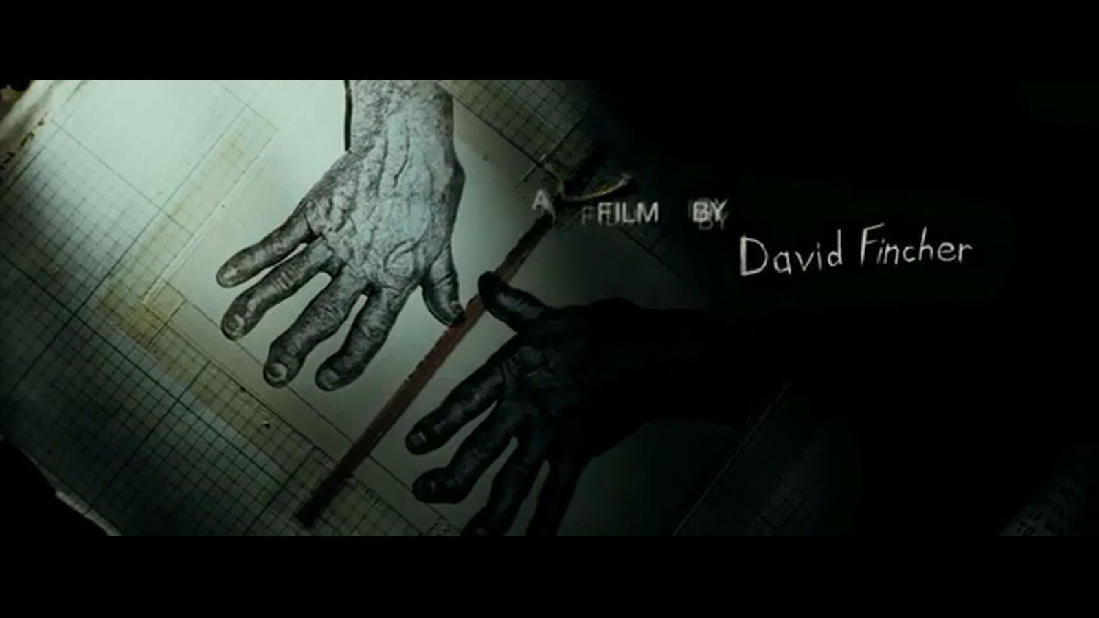
To begin, our title sequence will start with who created the film. Above is an example from David Fincher's movie Se7en. We haven't decided if we'll go with a company moniker, our actually put both of our full names like the picture above. As far as the font, it'll be quite different from the picture above, since our film isn't supposed to be eerie or creepy whatsoever. It'll be more of a colorful font, with a bold and large font and vibrant colors.
Next, of course we'll have to include our actors, or in this case, actor. What comes to mind immediately is the long and extensive title sequence of the HBO series Game of Thrones. The title sequence covers every actor in the show with intense visuals and animations in the background. I think this is a great example, other than the fact it doesn't say "starring". It's implied here, but in our short film we'll be saying "starring Luis Lastra" to differentiate the editing and producing from the acting. The font will also be much different, as the Game of Thrones font is very old-timey and medieval.
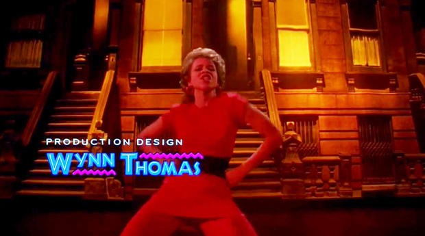
Furthermore, we're going to include a producer and designer title card. Above is an example from Spike Lee's "Do The Right Thing". I took inspiration from this picture due to the colorful and large font of the person's name, contrasting with the smaller and more plain picture of their role in the film. Instead of "production design", we'll be putting "production & editing", as we believe its more up-to-date and better reflects what I actually did. It would read "Production & Editing: Gabriel Valdes-Urra".


Comments
Post a Comment